Building a directory of the most aesthetic cafes in the world
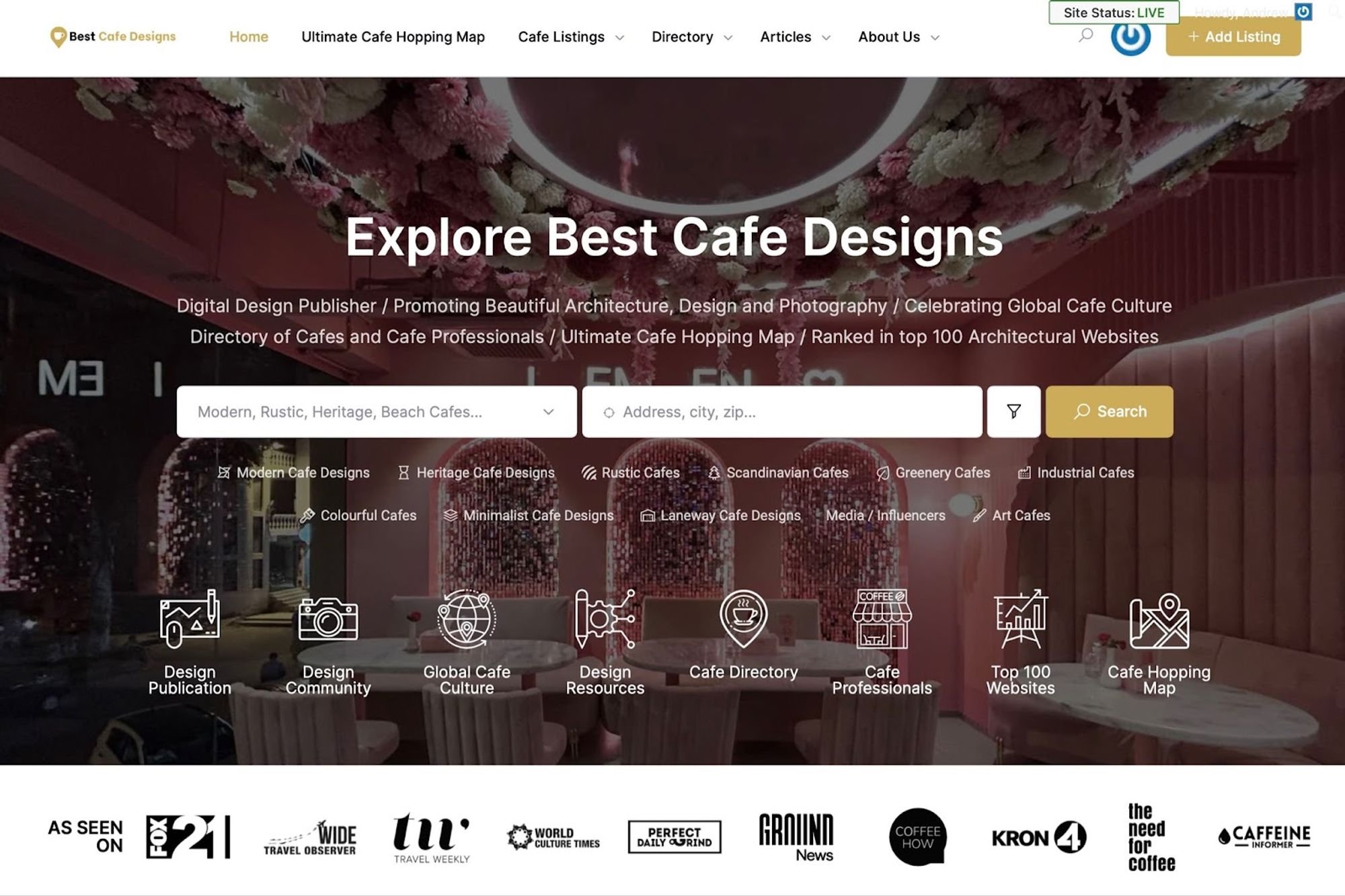
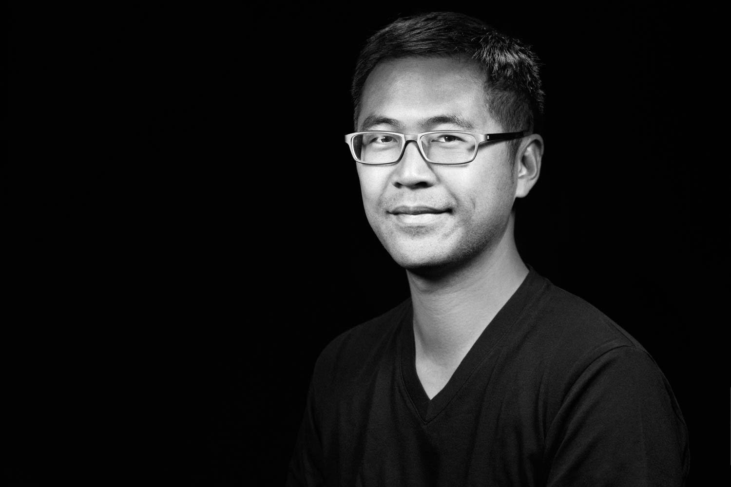
Sometimes I think starting this blog might have been a good idea after all. I have had a chance to meet many personalities that not only inspire you but also help you build your platform along the way. Andrew Chung is a name that might not ring a bell but Best Cafe Designs definitely will. It is more than a ‘yellow pages’ of cafes around the world while there are many that claim to be the same. His creation has quickly picked up steam, in this case traffic, and was recently ranked in the top 100 Architectural Websites.
Andrew is an architect based out of Sydney, Australia. His interests purely lies in architecture, a proficiency one cannot master if you are not even close to being captivated by the topic. He also enjoys photography, and spends considerable time dabbling in website design and tasting coffees. He once told me that his site is a reflection of things that he likes. Every bit of it is true. It's an open ended project that started as a blog and has now added a cafe hopping map and a directory of cafes, and cafe professionals. You can read more about his website here, his introductory post to this blog.
I’ve been wanting to interview him for a while now, but life got in the way. Unlike other coffee stories, I wanted his to be less about the coffee and more about cafes, design trends, website design, photography, and his top cafe picks.
Andrew, your website is quickly becoming the haven for aesthetic cafes and well-written articles covering photography and design. How was this idea conceived and why cafes in particular?
Thanks so much Syed for allowing me to share my project bestcafedesigns.com and continuing to collaborate! I really appreciate it. My website is a reflection and culmination of my skills and interests as an architect, photographer, web designer and coffee lover. I have created many projects and websites in the past, but found this project to be more enduring as it is something I really enjoy, and when you do things you enjoy, you can create something that has value and a life of its own.
Drawing together different threads, I always admire design publishing sites like ArchDaily and Dezeen, and I’ve always wanted to create my baby version of it. I use sites like Tripadvisor and Yelp, but find that they focus only on the food and drink offerings and not the aesthetics of the place.
My main work is on public, commercial and multi unit residential buildings, and so I was actually less familiar with cafe designs. As I was tasked with designing a cafe for a friend, I wanted to upskill fast and found this project an efficient and enjoyable way of attaining new skills. I love cafes as a place between work and home to socialize, plan and dream ahead.
I have recently undergone training in web design, in the setup and layout aspects, as well as search engine optimization to grow sites in organic search traffic. The site was a natural outcome and exploration of these threads. It has become a digital design publication, it was ranked amongst the top 100 architecture website and has proved to be useful for travellers and coffee lovers alike, and is on its way to becoming a directory and design resource for cafe professionals.
We have a few things in common. Although I am not an architect, I service architects and design consultants. We have our own websites albeit the concepts are entirely different, and I recently got into photography as well because I realized I love shooting people and spaces. Can you give emerging photographers like me some tips that can capture viewer’s attention.
Your photography is amazing, Syed, and very advanced and tuned for the niche! I noticed that there are many photographers sharing aesthetic cafes throughout the world on instagram. From an architectural photographers perspective, we focus on axial shots, like elevational or ¾ views, corrected verticals, not looking up or down, and showing spaces in context in super wide view for context as well as zoomed in to show unique construction details. We also like to frame and layer shots, so frames within frames are good, and capturing varying lighting conditions, whether natural or artificial. You are doing many of these things already.
I am very indecisive when it comes to website design and I ended up opting for a very basic minimalist approach. Being a cafe directory, how did you go about structuring different elements to keep it engaging and not overwhelming your readers at the same time?
That’s a good question, and something I’m constantly trying to work out. One of the good things about a cafe directory on its own, is that it holds hundreds of listings of cafe information that can be searched granularly through the front search bar and filter buttons. The quandary is that its not conducive to a ‘magazine’ type blog spread that is image dominant.
I’m working on a few areas to address this including refining the home page, and especially above the fold to have navigational buttons to access as much of the information of the website as possible. That included reorganizing the site many times to really distill what the main objectives of the site were.
As the site is still a startup, over 90% of audience arrives at my site from an article, or by searching into a specific cafe or page. I’m constantly refining the single page layout, including the menu bars, the side bars and footer to allow the audience to move to relevant topics, discover new topics and fulfilling the main objectives as a website to join the email list, for a recurring readership.
I was also very indecisive for other website projects. I’m more confident in the layout skills for bestcafedesigns.com, and regularly pivot and change. If there’s something I don’t know how to do technically, I outsource it to my daughter or to someone on upwork. In fact, I totally tore the website apart earlier this year and rebuilt it from the ground up just to add the cafe directory features.
According to you, what are some key considerations when designing a coffee shop layout to optimize customer flow and seating arrangements?
Customer flow and seating arrangements are an important consideration and depend on the tenancy size, orientation and frontages available. For example a cafe kiosk has different design challenges from a cafe with a narrow frontage and deeper tenancy area.
Regarding customer flow, that depends on the traffic anticipated and the team involved. Most commonly the cash register near the entrance expedites the ordering process. The coffee production line needs to be arranged to avoid overcrowding and the person taking the order near the final step allows to take the order as well as support in pouring milk and coffee delivery to the customer.
Seating arrangements have a functional requirement as well as being an essential design element. Windows and walls can be used for integrated seating booths and create different zones for diverse seating arrangements and groups to enjoy. Free seating needs to appear uncluttered and less bulky, but also comfortable and easy to maintain and clean.
What are some innovative design trends or features that are emerging in modern coffee shop design?
Some of the things I’m seeing are conveniently integrated charging stations, interactive menus, ambiance-controlling systems for light and sound. I think there are opportunities for cafes via monitoring to show their sustainability initiatives, and energy consumption through carbon or water saving measures. Also, customers are interested in where their beverage comes from. Perhaps there are opportunities to have a live feed from the coffee farm and the roasting facility to see how it all fits together.
Cafes are great multipurpose spaces. They can be a coffee place in the morning, a noodle place for lunch, high tea in the afternoon and an after dinner hangout. They can also be places for demonstrations, cooking classes, art classes, a gallery, a keynote and a workshop space. The cafe space can become an extension of the home, as well as an outlet for work through clever AV and modular furniture.
I have always had this question when looking at coffee shops in Dubai. Most of them are now adapting aesthetics over functionality. How do you balance both when designing the interior of a coffee shop?
The functional aspects of cafe design is highly regulated for the safe service of food and beverage to customers. This includes the separation of clean and dirty dishes, durable and robust materials, and sealed and coved junctions for easy cleaning. They are also influenced by good ergonomics as well as commercial aspects like good customer flow, and the easy handling of equipment. It is great that Dubai has so many diverse and aesthetic coffee shops. I hope to feature many of them on our cafe directory. After all the functional aspects are dealt with, there is still a lot of design leeway to develop a sense of place and character. I imagine that the competition for cafes is growing, and the need to differentiate is also growing. That’s great for the coffee lovers, but we really need to support our local coffee shops, that have invested so much into creating a beautiful environment for their customers.
Being one of the leading architectural blogs in the world, what are some common pitfalls or mistakes to avoid when designing a coffee shop from what you have seen?
Being part of the top 100 architectural websites to follow at feedspot has definitely piped my interest in digital publishing as a whole. Bestcafedesigns.com is the only website on the list to dedicate towards the cafe design niche. I feel the site now has a responsibility to develop design resources for the niche.
On common pitfalls, you’ve given me a new topic to explore and make a blog post about.
Some of the main things include not getting the balance of seating to counter area, not having the counter and coffee machine prominent enough, not investing in good lighting of the front counter, or not treating the lighting as a design feature in itself, creating awkward customer flows and not integrating enough display and storage, so there ends up being a mess of items on the counter.
What have you planned next for Best Cafe Design? I would love to see this platform evolve into video, perhaps? Have you given that a thought?
Really the project is just getting started. Many of the steps in getting the website in place won’t see the full effects of SEO for about a year. The site already has credibility in the architectural community space, but am aiming to get more involved, and make the site a great place for design professionals to connect and show off their work, as well as developing the traveller and coffee lover side.
In the next year, I think the site will be ready and open to brand partnerships, so if there are any coffee industry or design suppliers interested in aligning with this innovative project, please contact me!
On the content side, yes we are thinking more about video, 3D cameras and drone photography!
I see so many talented designers working in the cafe design space. I'm hopeful of acknowledging their work and expanding their audience. One of the big ways designers get acknowledged is in awards, and there are so many out there, that it would be hard for small designer firms to get a grasp of what they can enter into locally and overseas.
I'm in the midst of creating a new app called architectureawardstracker.com that helps designers find awards and track them in a visually intuitive way.
How do you balance between your full time job, managing the website and also give enough time to your family?
I’ve always had a challenging full time job in a practice that is passionate about great design, and sensitive to country, climate and community. Naturally, over the course of many projects and years, I’ve specialized in skills and enjoy visiting value to the practice like facade design and documentation and conceptual design. To elevate myself, I feel the constant need to develop cross skills, and therefore have worked on photography and now web design. A website is like a mini business, and so is great for developing design, marketing, networking and technical skills. They all feed back to my professional profile, so I don’t mind putting the time into it.
The main question is how to balance this with family life. If I cut into some leisure time, where I would just vegetate and Netflix, then this project is ok to fill in. Although your role in a family is never complete, I really prioritise family and serving at our local church. I wouldn’t have the energy to do these things with as much rigor when our kids were more dependent and younger, but now I have to say that my kids are at an age where I can pursue these types of projects, and actually involve them in web design, marketing and data management etc. It’s fun to do a family project together.
Lastly, I think we are all dying to know. What are your top 4 picks for the best cafe designs in the world?
For a bit of context, I’ve searched through about 2000 cafes, and featured around 300 on my website. I still have 1000 cities to go through, and about a million more cafes to research.
Your audience can always check our most popular cafes, but, from what I’ve looked up and explored, these are my top 4:
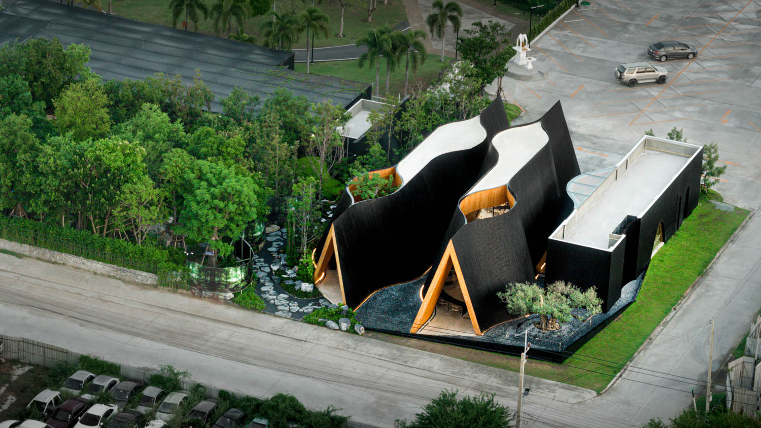
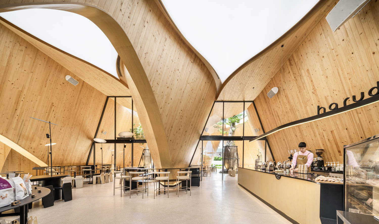
Harudot / Nana Coffee Roasters / IDIN Architects Thailand
Designed by IDIN Architects
The genesis of Harudot stems from a collaboration between the Nana Coffee Roasters brand owner and a landlord with a passion for plants with unique forms, culminating in a harmonious fusion of coffee culture and botanical aesthetics.
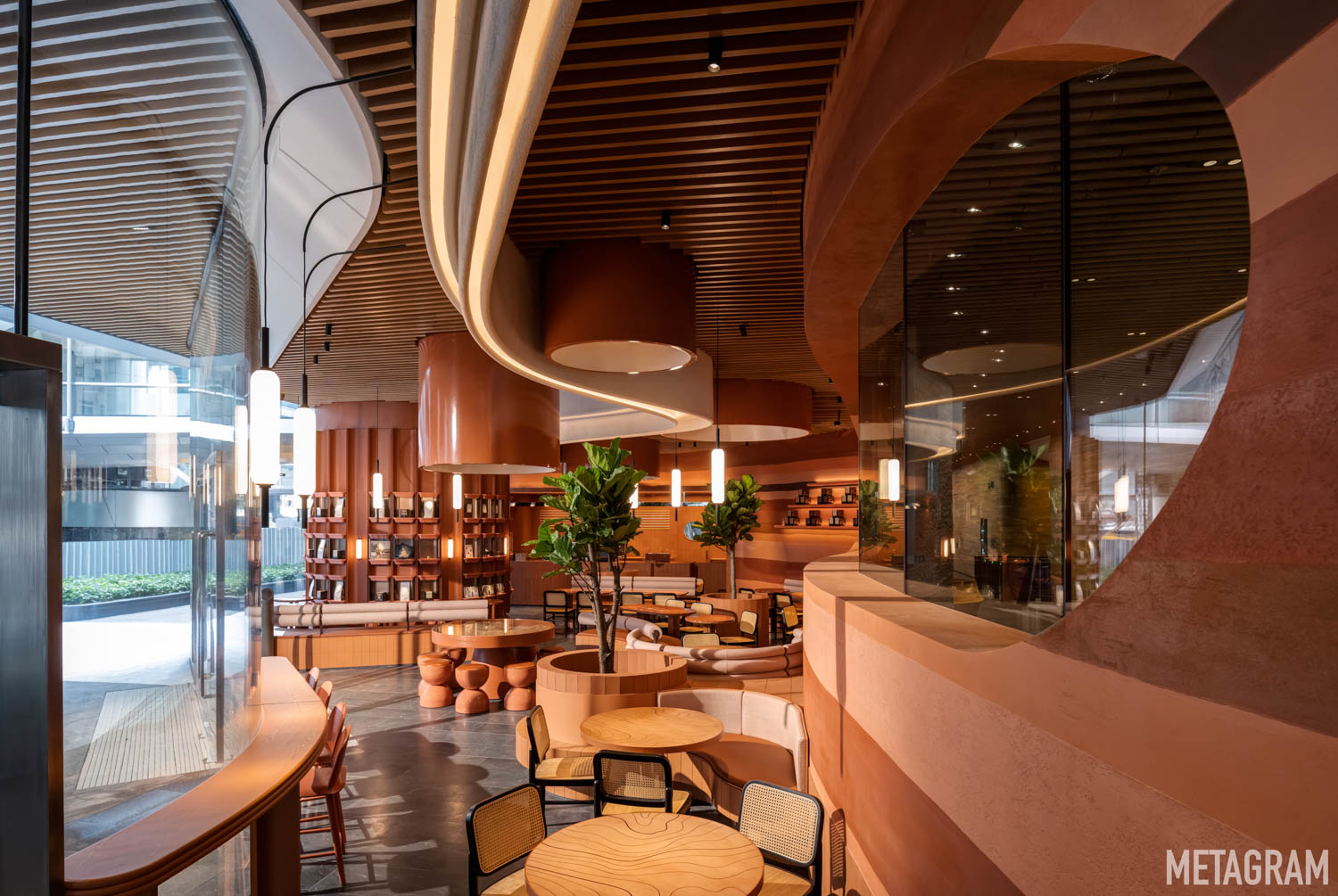
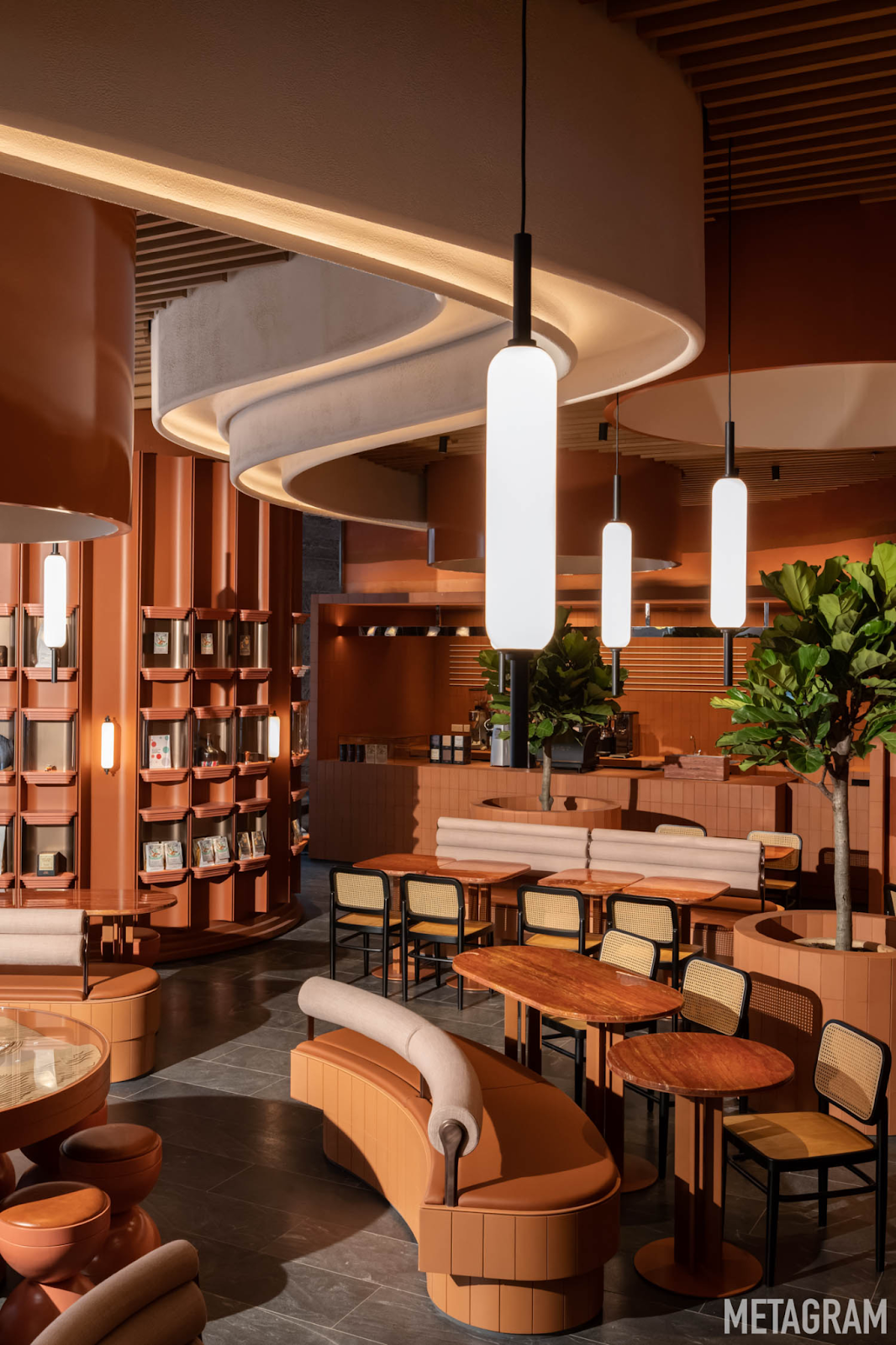
Alchemy Origin / Metagram
Designed by Metagram
Metagram has designed Alchemy Origin, the newest cafe addition to the Alchemy Coffee group, in the premier business district of Tai Koo Place in Hong Kong’s east.
Nestled into the chic, newly completed lobby of Two Tai Koo Place, the cafe is located in a narrow and winding space which sits between a curved courtyard-facing facade and an S-shaped wall bordering the building’s commercial lift lobby.
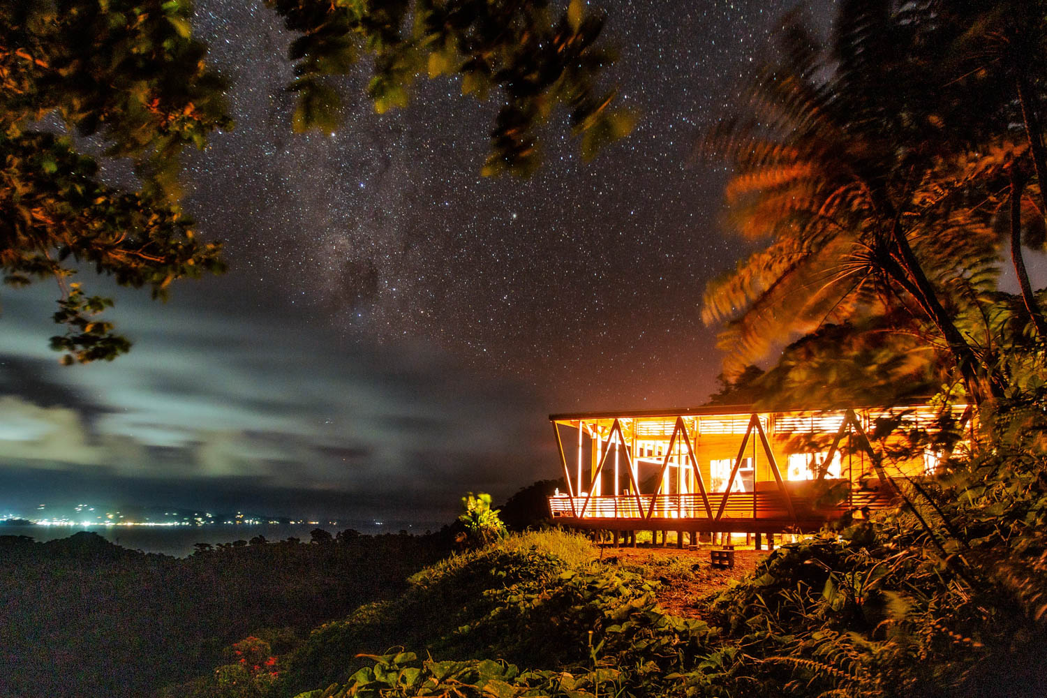
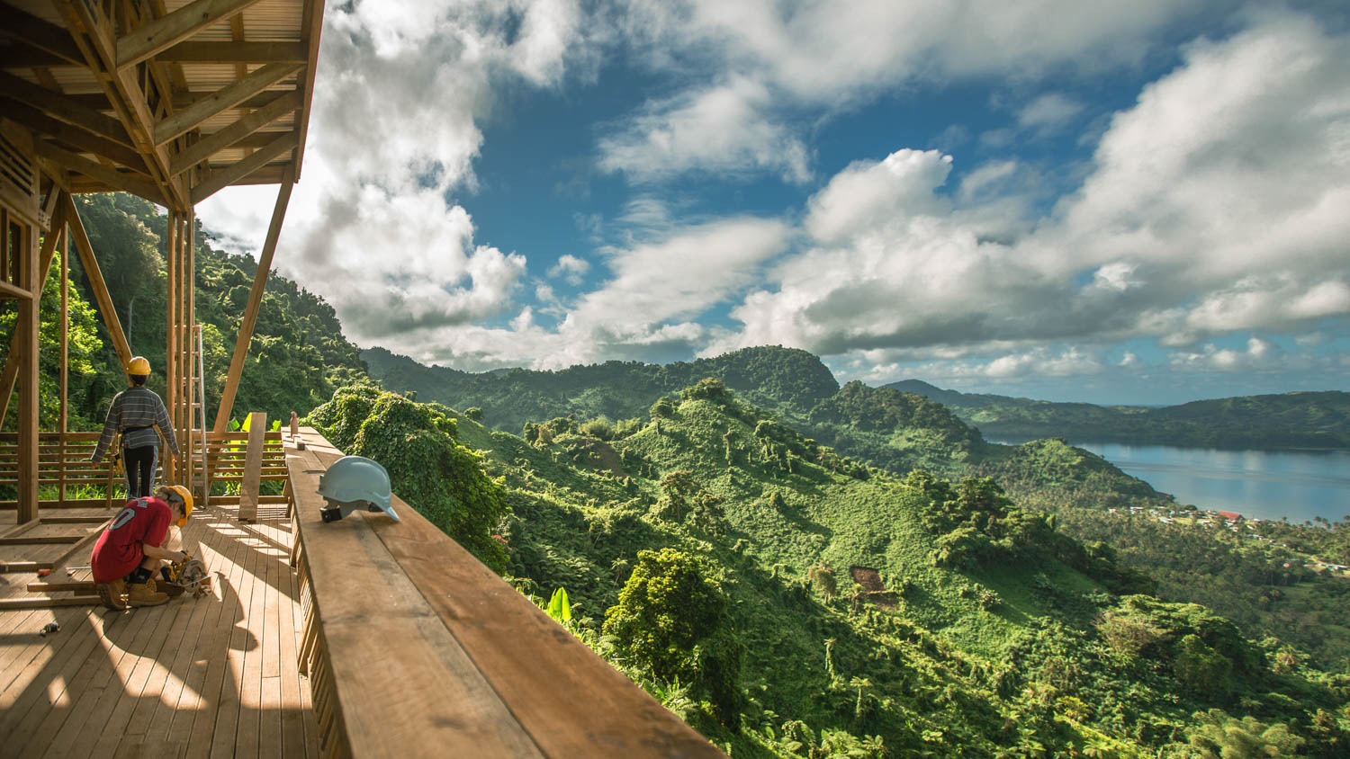
Fiji Cafe / Urata Look Out Cafe / Caukin studio
Designed by Caukin Studio
The Urata community and Savusavu Rotary Club identified a unique opportunity to develop a community fiji cafe which would serve both local and international tourists who journey between the two main towns on the island, Labasa and Savusavu.
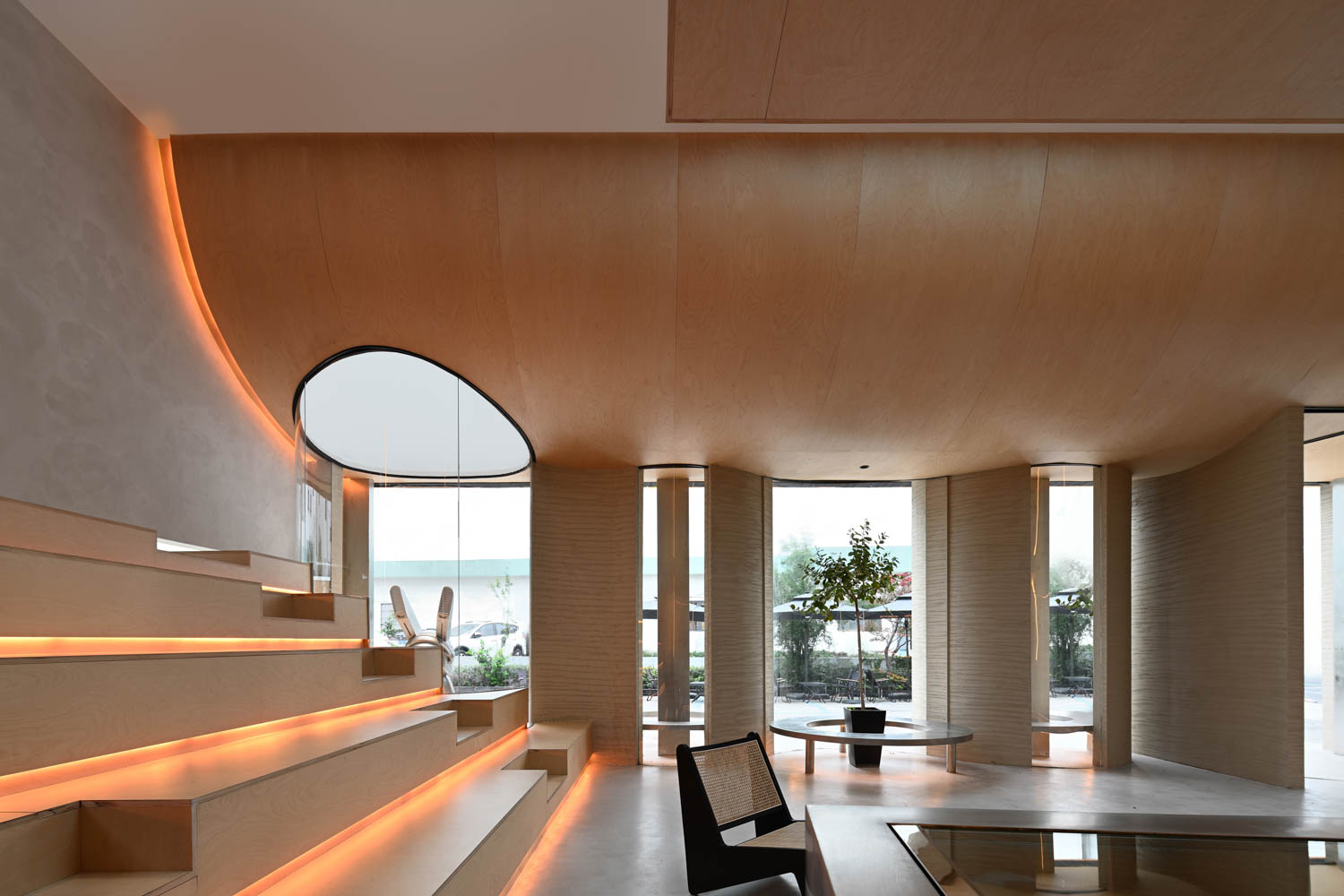
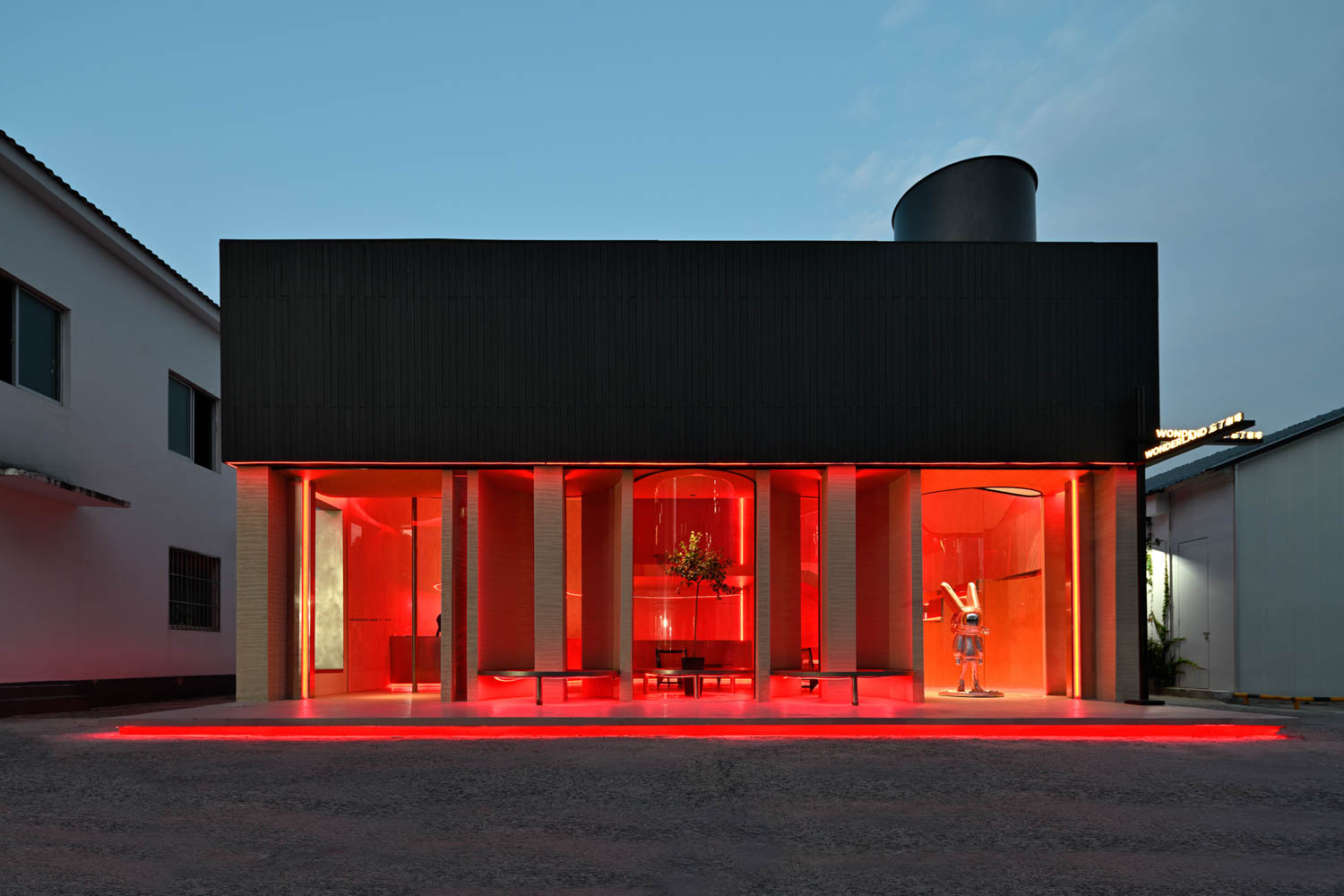
Suzhou China Cafe / Wonderland Cafe / Xiao.Design
Designed by Xiao.Design
The location of Suzhou China Cafe / Wonderland Cafe is far away from the busy streets. If the architectural structure is classified as a single layer, the utilization rate is not high; if it is classified as a double layer, the space is not enough, and the designers will burst out inspiration between this sense of contradiction and challenge, combined with the commercial needs, turn the old into the new, and create a simple style.
Best Cafe Designs by Andrew Chung
Andrew Chung is an architect, photographer, website designer, coffee drinker and founder of bestcafedesigns.com based in Sydney. His site charts the growth of global cafe culture and collaborates with over 40 architects, photographers and writers.


